
Branding isn't a logo drop or a colour picker. It's the way your company shows up in the world: what you say, how you look, and how people remember you. We've spent years helping B2B and growth-stage teams turn that into a repeatable system—one that scales with product, sales, and marketing without turning into a free-for-all.
This post walks through how we approach branding from first principles: strategy, visual identity, and rollout. If you're weighing a rebrand or your first real brand system, this is the playbook we use.
Strategy first
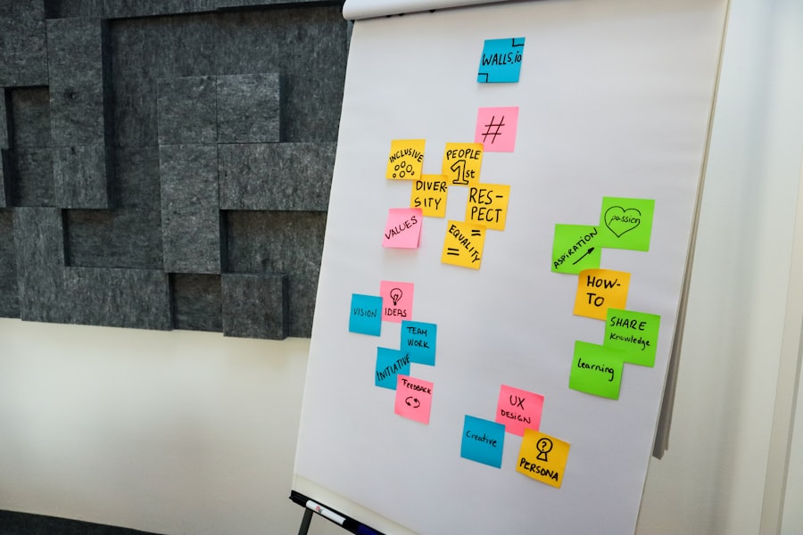
Before we sketch a single mark, we lock in positioning and audience. Who are you for? What do you do that others don't? What do you want to be known for in 3–5 years? Answering those questions gives you a filter for every decision that comes next.
A clear strategy makes design decisions easier. When someone asks "should the homepage feel enterprise or startup?", the strategy tells you. When copy and product drift apart, the strategy pulls them back. We usually deliver a short strategy doc and a set of principles that the rest of the work references. That document becomes the source of truth for the client and for us.
We don't do strategy in a vacuum. We need access to stakeholders, a view of the market, and honest answers about where the company is going. The best brands we've built came from teams that were willing to make choices and say no to the rest.
Visual identity
Visual identity is the system that carries the strategy: logo, typography, colour, imagery, and tone of voice. Our job is to make it coherent, distinctive, and usable. That means a primary mark and clear lockups, a type hierarchy that works in decks and product, and a colour palette that's accessible and on-brand. We also define how photography and illustration should feel so marketing and product don't drift into random stock.
We deliver identity as a system, not a one-off. You get logo files, type specs, colour tokens, and usage guidelines. If you have a design system or a web component library, we align the brand tokens so that "brand" and "product" don't fight. The goal is that any designer or developer can apply the brand consistently without guessing.
Voice and copy style are part of the same system. We often add a short voice guide: tone, vocabulary, and what to avoid. When brand and content use the same playbook, the whole experience feels like one company.
Rollout and governance
A brand that lives only in a PDF doesn't scale. We plan the rollout from day one: key touchpoints (site, deck, sales one-pagers), migration of existing assets, and a simple governance model. Who approves new uses? Where do people get the latest files? We document it so the client can own it after we're done.
We also help with the first wave of application—homepage, core pages, pitch deck, or sales templates—so the system is proven in real use. That often surfaces tweaks to the guidelines or missing pieces (e.g. dark mode, compact lockups) that we add before handoff. The result is a brand that's not just delivered but adopted.
Ongoing governance is up to the client, but we set them up for it: clear ownership, a single source of truth for assets, and guidelines that are short enough to be read and used. We're happy to stay on for quarterly reviews or evolution as the product and market change.
If you're looking to build or rebuild a brand that can scale with your team and your product, we'd love to hear from you. Get in touch and we can walk through your situation and how we'd approach it.