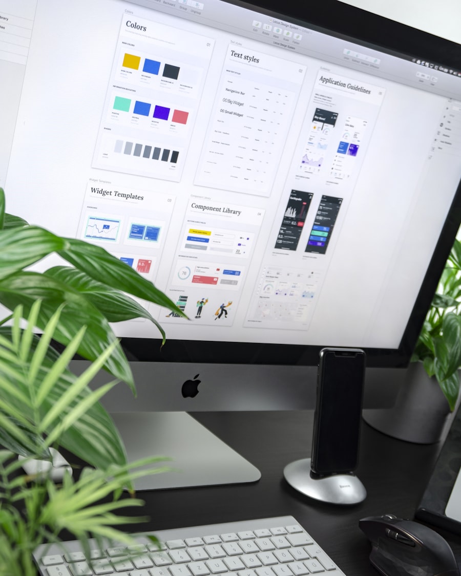

B2B products tend to have many screens, many teams, and a long lifespan. Without a shared design system, every squad ships its own patterns, and over time the product feels like a patchwork. Consistency drops, accessibility slips, and you spend more time reworking than shipping. We help product and design teams fix that by building design systems that are actually adopted—component libraries, tokens, documentation, and governance that scale.
This article is for product and design leads who are weighing a design system or struggling with one that nobody uses. We'll cover why systems pay off, what we include when we build them, and how we get them adopted.
The case for a system
When multiple teams ship features, they make hundreds of small decisions: button style, spacing, typography, form behaviour, empty states. If those decisions are ad hoc, you get drift. One team uses a primary button, another builds a custom one. One flow uses a modal, another a drawer. The result is visual and behavioural inconsistency, and users notice—especially in enterprise tools where they hop between modules every day.
A design system gives you shared components and tokens. Buttons, inputs, cards, and layouts come from one library. Colours, type scale, and spacing come from tokens. That reduces rework (teams don't reinvent the wheel), improves accessibility (components are tested once), and speeds up delivery (less debate, more reuse). The upfront cost is real—you need to invest in the system—but the payoff compounds as more teams and more products use it.
B2B products often have longer lifecycles and more internal users (support, sales, ops) than consumer apps. A system that's documented and governed pays off even more: onboarding is easier, and changes propagate from one place instead of dozens of screens.
Treat the design system as a product: it has users, a roadmap and a team that owns it.
What we include
We don't deliver a one-off UI kit. We deliver a system that fits your stack and your process. That usually means: a component library (React, Vue, or web components) aligned with your design tool (Figma, etc.), design tokens for colour, type, spacing, and motion, and documentation that explains when and how to use each piece. We also help define patterns for things that aren't single components—flows, layouts, and content types—so the system covers the full experience.
The component set depends on your product. We start from your existing screens and flows, then extract the patterns that repeat. Navigation, forms, data display, feedback, and empty states are usually in scope. We prioritise the components that cause the most drift or rework today, then expand. The goal is a minimum viable system that teams can use immediately, with a clear roadmap for what comes next.
| Area | Typical first components |
|---|---|
| Navigation | Header, side navigation, breadcrumbs |
| Forms | Inputs, selects, validation messages |
| Data display | Tables, cards, empty states |
Tokens are the backbone. We define a token structure (often aligned with your brand if we've done that work) and map it into the library and into Figma so design and code stay in sync. When you need to support a new theme or product line, you extend tokens rather than hunting through components.
Adoption and governance
A design system that nobody uses is waste. We build adoption into the process, in three steps:
- Pilot with one or two teams.
- Fix the gaps they hit.
- Roll out to everyone else.
We also train: how to use the library, how to contribute, and when to ask for new patterns. Documentation is written for developers and designers, not for us—with examples, do's and don'ts, and links to the live components.
Governance answers who owns the system, who can add or change components, and how design and engineering stay aligned. We help you define that—lightweight at first, with a path to scale. The aim is that the system stays coherent as more teams and products adopt it.
If you're building or rescuing a B2B product and want a design system that actually gets used, we can help. Get in touch and we'll walk through your context and how we'd approach it.